
No, I am not the normal guy handling Joe duties at the site. While I am enjoying the Classified Series, I am not as much of an expert on the property as guys like Benty and MattK, so I generally sit back and enjoy their musings on this new line. That said, I was keen to pick up this new Scarlett repaint when I saw it go up for sale at Dorkside, so I wanted to share some thoughts.


Trust me, I wish I was more of a Joe expert. Joe was a no-go at my house when I was a kid, and while that is a story for another time, I have my OWN money now, so I buy what I want! As you can see, I am a normal functioning adult… Anyway, since Classified is my first real foray into Joes, most of these new releases mark the first time I have owned a figure of any of these characters. However, we are not even to the proper series three yet, and I already own two Scarlett figures. Like most of the figures in the line, I think Scarlett’s foundation is really strong with great sculpting, character details, and accessories, but this new repaint seems to indicate that the Hasbro team is already wrestling with what I consider one of the biggest weaknesses of the line so far: the color palettes.


I know expectations have been (understandably) high with this line, and if scarcity and Target exclusive scarcity are indications, a rabid fanbase is already built in. For the most part, as mentioned, I think Hasbro has answered the call. Sure, it appears many people were just expecting (wanting?) straight updates of the original A Real American Hero line, but that has not been direction they have taken. Sure, most of the guideposts, references, and designs have their history in that line, but Classified is an updated line with updated purposes and stories. I am cool with that, but like many, I want these things to be balanced between iconic history and new paths.


I think there have been good parts to this, and some parts that have been not so good, but I expect that for any and all action figure lines I collect. I attention to detail and updates to the classic tropes have been realized in really cool fashion. I think a lot of the updating to the character designs have been good, but there is a tendency to get a bit over-designed here with characters like Roadblock assuming a less iconic reference, and Cobra Commander missing pretty much entirely. Yes, I admit, CC not my favorite, but I think there will be updates in the future that will hit the marks more closely. Indeed, as we look to upcoming releases like Zartan, Flint, and Lady Jaye, you can see the stronger iconography breaking through, so I am hoping that is the direction for what is to come.
Either way, I am invested in this line now, and I am definitely enjoying most of it, so I say bring it on. As I said, I am not really going to review this Scarlett – MatthewK did a lovely feature on the original release, and since this is simply a repaint of that, go check out his thoughts if you want the full rundown. As always, he did a great job. I am really only here to focus on the changes, and that comes in the form of costume deco and portrait/face changes. These might seem minor, and some of them are, but I have a bit of a point here: some simple paint swaps can dramatically turn the look of these figures, and I see possibilities in that. Sure, the repainted costume on this particular Scarlett might not be the most exciting thing in the world, or even much of a departure from the original, but there is a chance for that if Hasbro decides to support it.


Okay, so, the original Scarlett took some of her color cues from the original RAH figure, but then got a little crazy with the paintbrush, too. I will just come out and say that I do not like the gold used in this line AT ALL and I hope it is being retired, but Scarlett is one of the early figures that who still got pretty garish beyond that. The barrage of multiple blues, red, and yellow when coupled with that gold gets bewildering to the eye, and the direct is lost, in my opinion. Granted, I don’t HATE it, but I was pretty much looking for another coloration from the moment I got the figure, but I find the sculpting work to be very strong.
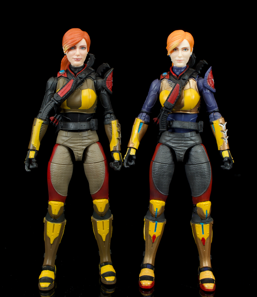
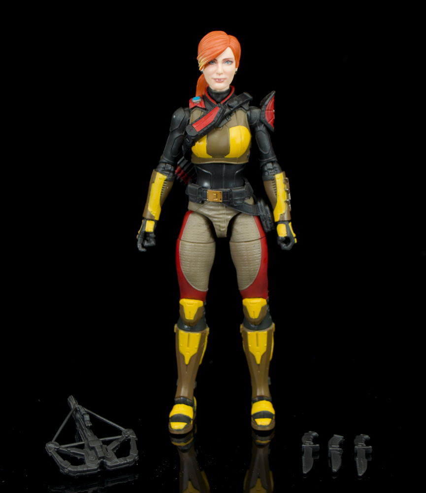
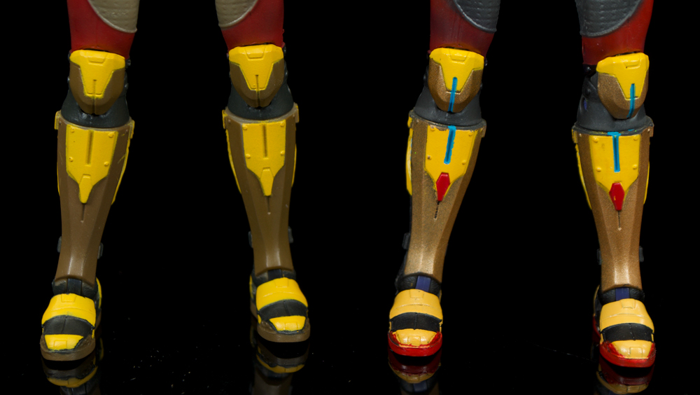
This new figure trades most of the blues for black and tan (not the beer), and the gold for brown. I wish I was bit more learned in the costume variation history of Scarlett to tell if this is a legitimate change that recalls a different look, or something that has been newly created for this line. As it stands, I am glad the gold is gone for the most part, but past that, I am not sure if any other changes are really improvements, or are just different. Some of the reds has been lost, but they are mostly still there, so they tend to still stand out on the figures and frankly, I think they detract from one of Scarlett’s most defining physical qualities: her hair.


This version has different colored hair (we will get to that in a moment), that hair is what makes her instantly recognizable, so diluting it with red in the costume kind of works against that iconography. This might just be my brain being crazy, but it all makes the outfit look more tactical “superhero” rather than tactical military. Yes, I know the colors in the original RAH line ran amok as it aged, but Scarlett was a part of the early releases then, so she did not really absorb a lot of that. Like I said, it is not completely egregious, just not as keeping with the character as I would like to see.
The head/portrait also gets a repaint here, and this is spot where this new version really shines, in my opinion. I know there has been some discussion and disagreement about the head and the Scarlett likeness, but I have always liked it. It is expressive, it has a lot of personality, and a BIG credit to the sculptor/designers on this line as a whole, because thus far, the females do not look anything alike, and that is a great thing. For the original Scarlett, the face printing has been handled well, and I love the freckles, they are a simple addition, but adds a completely new layer to the details. I have heard some back and forth about the hair color being too bright, and I can see that, even if it didn’t bother me, but this is a spot where the new version comes in and makes some solid updates.
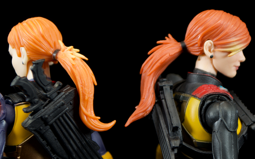
While I have always liked the Scarlett portrait, something seemed just a bit off to me, and I have not been able to put my finger on it. Well, that is until a friend pointed out that the original release Scarlett just looks too young for the character. That is it. He nailed it. This new version though, with her added facial details and darker hair color ages up the character to about the perfect spot for me. Yes, that could be a superficial observation in that this version looks to have more make-up (an admittedly ridiculous requirement for her function), but the printing/airbrushing brings out more of the sculpted lines in the face to show off the definition hiding there. I think that overall, it is just better paint detailing that helps to maximize the work done in the sculpting.
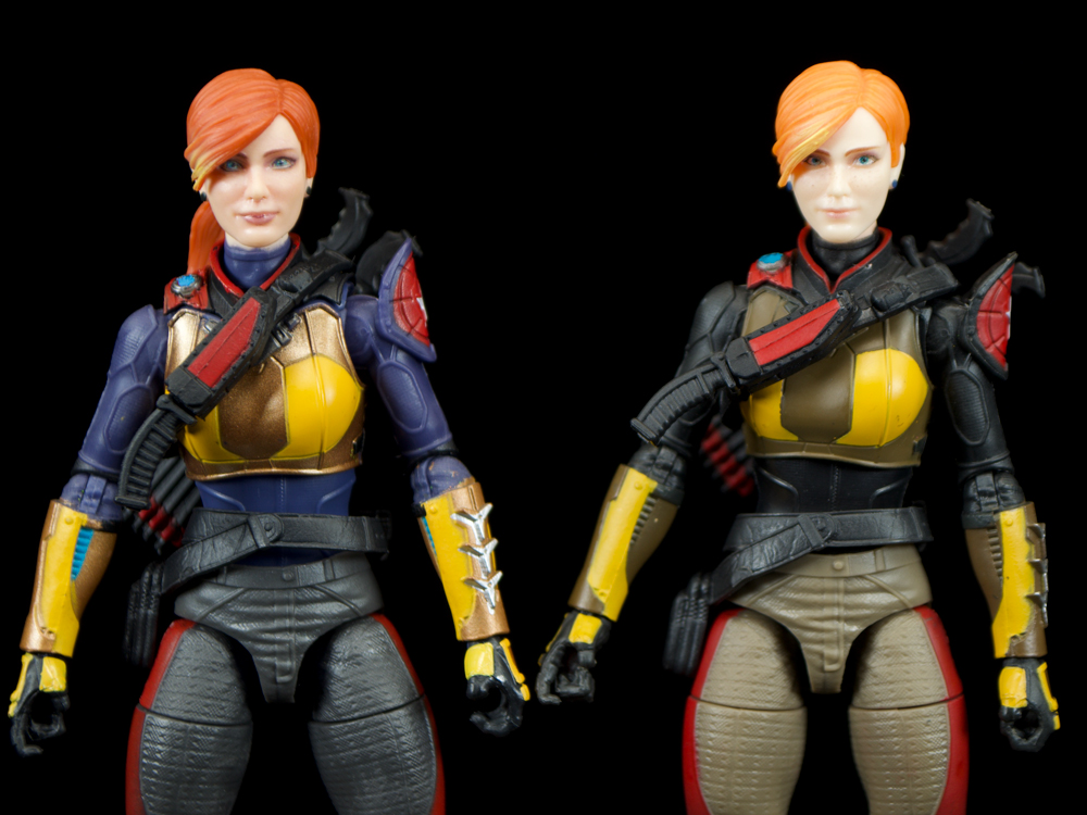
The hair is also darker and looks more natural to me here, but still retains the highlights from the first version. Like I said, I know many people balked at the original hair color (Wendy’s comparisons have been rampant), but I find it to be fine. When it comes to the actual color, am good with either of these versions, but the new one offers a bit more application and ability to see some more of the sculpting that gets a bit washed out in the brighter version. Yes, the make subdued color will likely make this one the winner for most people, but I find its advantage to be its better cooperation with the sculpt work. The ponytail on mine is slightly different from the original in that there is no “flip” at the end, but I think that is likely a mold error rather than a tool update.

Ultimately, I think I am going to make the best of these two figures and do a head swap so the new one sits on the original body for my default Scarlett on the shelf. Yes, that keeps the blast of gold that I dislike present, but in the end, the scheme still feels closer to her RAH roots. Which brings me to last point: for those of us who want this line to hit that Real American Hero iconography just a bit more, I think most of these figures are just a repaint away. Sure, this one doesn’t get us there, but I have seen some of Duke and others out there that have been given paint treatment to match their vintage figures, and it mostly work REALLY well. It seems too obvious, so hope, and expect, that a Classified “Retro” line will be an offshoot of this main series, much like how Marvel Legends and Star Wars Black Series handle it. Give us repaints to match the vintage figures on cards that resemble the original backs, and watch us buy them all again, Hasbro.
You can get this new Scarlett repaint at Dorkside Toys now.


I like the first one better.
Ugh that’s annoying, I want to find this version.
Same
Does anyone know if the UPC’s are the same?